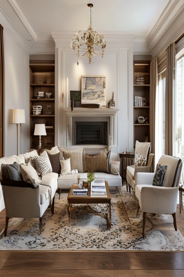

This small living room is built around a very clear seating conversation: two beige fabric sofas, a square glass coffee table with a dark metal frame, a patterned area rug, a colored glass table lamp, a tall leafy plant and framed wall art on two sides of the corner. The strongest editorial subject is the way the furniture creates a compact, traditional seating zone without relying on built-ins or architectural drama.
What makes the room useful to study is its honesty. The layout is not expansive or overly styled. It shows a real small living room problem: how to make two substantial sofas, a coffee table and decorative layers feel ordered inside a tight footprint. The room succeeds most when the seating, rug and corner lighting work together as one composition.
Why Does the Seating Arrangement Feel Like the Main Design Decision?
The two sofas carry most of the room’s visual weight. They are similar in tone, scale and upholstery, which makes the seating area feel unified even though the sofas sit on different sides of the corner. That shared beige fabric is important because it keeps the eye from reading the room as a collection of unrelated pieces.
The arrangement creates a compact conversation area rather than pushing all furniture against a single wall. One sofa runs along the left side, while the second sofa anchors the right side of the image. The open angle between them allows the coffee table to sit as a shared center, so the layout feels social rather than simply storage-driven or decorative.
For a homeowner recreating this kind of seating plan, the lesson is to choose upholstery pieces that can visually cooperate. Matching color temperature matters more than perfect matching sets. Here, the beige sofas relate closely enough that the room reads as one seating composition, while the pillows and surrounding decor add variation.
How Does the Glass Coffee Table Control the Center of the Room?
The square coffee table is the room’s strongest proportional tool. A solid wood or upholstered table of the same size would make the center feel heavier. The glass top keeps the patterned rug visible beneath it, while the dark metal frame gives the table enough outline to be read clearly from above.
The curved lower supports are a useful contrast to the rectangular sofa arms and square tabletop. Small rooms often become rigid when every object is box-shaped. In this photograph, the table’s darker frame adds definition, but the glass surface prevents it from visually blocking the seating area.
The practical takeaway is to treat the coffee table as part of the circulation plan. The table should be large enough to serve both sofas, but not so visually heavy that it closes the space. This image shows why a transparent surface can work well when the rug below deserves to remain visible.
Why Is the Patterned Rug Doing More Than Adding Decoration?
The rug gives the seating arrangement a boundary. Without it, the two sofas and glass table would sit on the wood floor as separate pieces. The pattern gathers them into a defined zone and makes the room feel intentionally furnished.
Its colors also matter. The muted burgundy, olive, beige and dark border tones pick up the warmth of the sofas without copying them exactly. That prevents the room from becoming flat. The rug introduces depth, but because the pattern is under the furniture rather than on every wall, it does not overwhelm the small footprint.
A common mistake in rooms like this is choosing a rug that is too plain because the room is small. This image suggests the opposite can work: a patterned rug can make a compact living room feel more complete when the upholstery remains calm and the furniture layout is simple.
What Role Does the Corner Lamp Play in the Seating Layout?
The table lamp between the sofas is doing several jobs at once. It lights the corner, gives the seating area a warmer evening mood and creates a vertical pause between two large upholstered forms. Its colored glass surface also adds a crafted detail that suits the traditional tone of the room.
Because the lamp sits behind the coffee table and between the sofas, it helps explain how the room should be used. This is not just a decorative lamp placed on an empty surface; it marks the shared corner of the seating area. The light draws attention to the point where the two sofas meet.
The design lesson is simple but often missed: in a compact seating plan, a lamp can act as a layout marker. It can soften a corner, support reading or conversation, and make the seating group feel finished without adding another large piece of furniture.
How Do the Plant and Wall Art Balance the Upholstered Furniture?
The tall leafy plant introduces the only strong organic shape in the corner. That matters because the room contains many hard outlines: sofa arms, picture frames, the square table and the straight wall junction. The plant breaks that geometry without requiring more furniture.
The framed artwork on the left wall and the larger framed piece on the right give the seating area height. Without them, the beige sofas would dominate the lower half of the room and leave the walls feeling unfinished. The frames also create a quiet relationship with the dark coffee table frame, repeating dark outlines in different parts of the composition.
When recreating this approach, the key is not to fill every wall. The image works because the art is placed where it supports the seating group. One framed piece sits above the right sofa, while another appears on the left wall, making the corner feel wrapped rather than abandoned.
Where Does the Room Feel Most Balanced, and Where Is It Tight?
The strongest balance comes from the triangle between the two sofas, the coffee table and the corner lamp. Those elements give the room a clear center. The eye understands where people would sit, where drinks or books would land, and where the warmest light source belongs.
The tighter moment is the amount of furniture mass relative to the room size. Both sofas have substantial arms and deep cushions, so the layout depends on the glass table and open floor visibility to avoid feeling crowded. A bulkier table or another large storage piece would likely make the center feel compressed.
This is where proportion becomes more important than style. The sofas are visually heavy, but the room remains readable because the table is lighter, the rug creates order and the wall decor lifts attention upward. The design succeeds by counterbalancing upholstery mass with transparent, patterned and vertical elements.
What Should Be Avoided in a Room This Compact?
The first mistake would be adding another dominant furniture piece to the center. The room already has two substantial sofas, a square coffee table and a rug with a strong border. More mass in the middle would reduce the clarity that currently makes the seating area easy to understand.
The second mistake would be replacing every layered detail with something plain. The patterned pillows, framed art, plant and colored glass lamp give the room its traditional character. If those pieces were removed, the beige upholstery could become too flat. The better edit is selective restraint: keep the objects that strengthen the seating group, and avoid adding pieces that do not relate to the sofas, table or rug.
How Can Homeowners Apply This Seating Strategy?
Begin with the seating relationship, not the accessories. Decide whether the room needs two sofas, a sofa and chairs, or one sofa with a lighter secondary seat. In this photograph, the two-sofa arrangement works because the coffee table can serve both sides and the rug ties the group together.
Next, choose one element that keeps the center from becoming visually dense. Here, that element is the glass tabletop. In another room, it might be an open-frame table or a slimmer round table, but the principle is the same: the center must support use without blocking the room visually.
Finally, add vertical layers only where they strengthen the layout. The corner lamp, plant and framed art all relate to the seating area; they are not scattered around the room without purpose. For a different living room approach where architecture rather than seating becomes the main feature, compare this with the modern organic living room built-in shelving analysis.
What Is the Main Design Lesson From This Room?
The room proves that a small traditional living room does not need a dramatic focal wall to feel designed. Its success comes from furniture proportion, a clear shared center, warm corner lighting and a rug that gives the seating area a boundary.
The best part of the composition is the way the major pieces understand their roles. The sofas provide comfort and weight. The glass coffee table keeps the center visually open. The rug organizes the floor. The lamp and wall art add height. The plant softens the corner. Together, they turn a compact seating arrangement into a complete living room rather than a group of furniture placed around the edges.