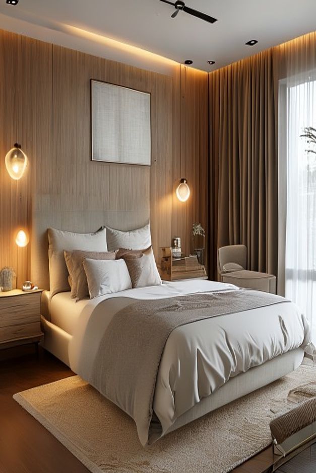

This bedroom is compelling because the enclosure does most of the decorating. Vertical, light-toned wall paneling wraps the bed and continues toward the window, giving a modest sleeping area the composure of a purpose-built suite. The upholstered bed remains soft and pale, so the architecture can lead without making the room severe.
The photograph rewards a careful look at alignment. The bed is centered beneath a restrained framed piece, circular wall lights mark the bedside zones, and the curtain line extends nearly to the ceiling. None of those moves is loud on its own. Together, they turn a simple rectangular room into a measured sequence of vertical planes and warm pools of light.
A Paneled Enclosure Replaces a Conventional Accent Wall
Rather than stopping behind the headboard, the narrow vertical boards continue across the visible corner. That continuation matters: it makes the bed feel contained by the room instead of backed by a decorative panel applied after the furniture was chosen. The grain remains subtle enough that the wall reads as texture, not pattern.
The central field behind the bed appears quieter than the flanking boards, which creates a broad visual mat around the artwork and headboard. A similar scheme needs this hierarchy. If every strip had the same contrast, the wall would become busy at pillow height and compete with the layered bedding.
Circular Bedside Lights Break the Vertical Rhythm
The small ring-shaped fixtures are effective precisely because their geometry differs from the tall panel joints. Their warm glow forms two low points of attention while concealed light at the ceiling draws a continuous horizontal line. This contrast keeps the room from feeling like a tunnel of repeated slats.
One bedside also carries a lower glow close to the nightstand, creating useful variation rather than perfect mirroring. Anyone adapting the idea should coordinate light positions with the mattress and pillow height before panel joints are set. The related discussion of upholstered headboards with vertical wall treatments offers another way to balance soft and rigid surfaces.
Curtains Complete the Corner Instead of Hiding It
Heavy taupe drapery occupies the short wall beside the bed, while a translucent inner layer softens the bright opening. Because both treatments begin high, the window feels almost full height. The fabric folds also absorb the sharp change of direction where the two paneled walls meet.
The upholstered chair fits into the narrow gap between the bedside table and glazing. It is secondary in scale and color, so it does not interrupt access to the bed. The chair works as a small pause at the window rather than a separate seating zone that would demand more floor area.
The Bed and Rug Set a Soft Lower Register
Most of the room's tactile weight sits below waist height: the rounded bed frame, loosely layered duvet, textured throw, and pale area rug. That low concentration of softness counterbalances the tall, precise wall treatment. It also prevents the minimalist palette from reading as a showroom exercise.
The rug extends beyond the sides and foot of the bed far enough to establish a landing zone, yet it leaves a strip of warm flooring visible. That exposed border is useful because it separates the rug from the panel color. Filling the floor edge to edge would blur the distinction between the room's horizontal and vertical surfaces.
Clearance Is Preserved Around a Generous Bed
The bed occupies much of the width, but the circulation remains legible. Narrow nightstands hug the wall, the chair is pulled into the window corner, and no object projects into the route at the foot. The composition accepts that the bed is the main use rather than pretending the room can support several competing functions.
A less disciplined plan might add a bench or larger case pieces because the photograph looks luxurious. The better lesson is subtraction: retain bedside access, keep the foot path open, and let the wall carry visual richness. In a small bedroom, architectural continuity can provide presence with less physical clutter than another piece of furniture.
The Artwork Holds a Quiet Center Above the Pillows
One pale framed piece is positioned high on the central wall field. Its near-neutral surface does not compete with the timber grain, yet the dark frame gives the bed a precise midpoint. The scale is intentionally modest; a wider canvas would crowd the circular lights and weaken the vertical panel rhythm.
The empty wall surrounding the frame is equally important. It allows ceiling light to wash down the boards without crossing a busy gallery arrangement. In this photograph, one restrained image completes the axis more convincingly than several smaller pieces could.