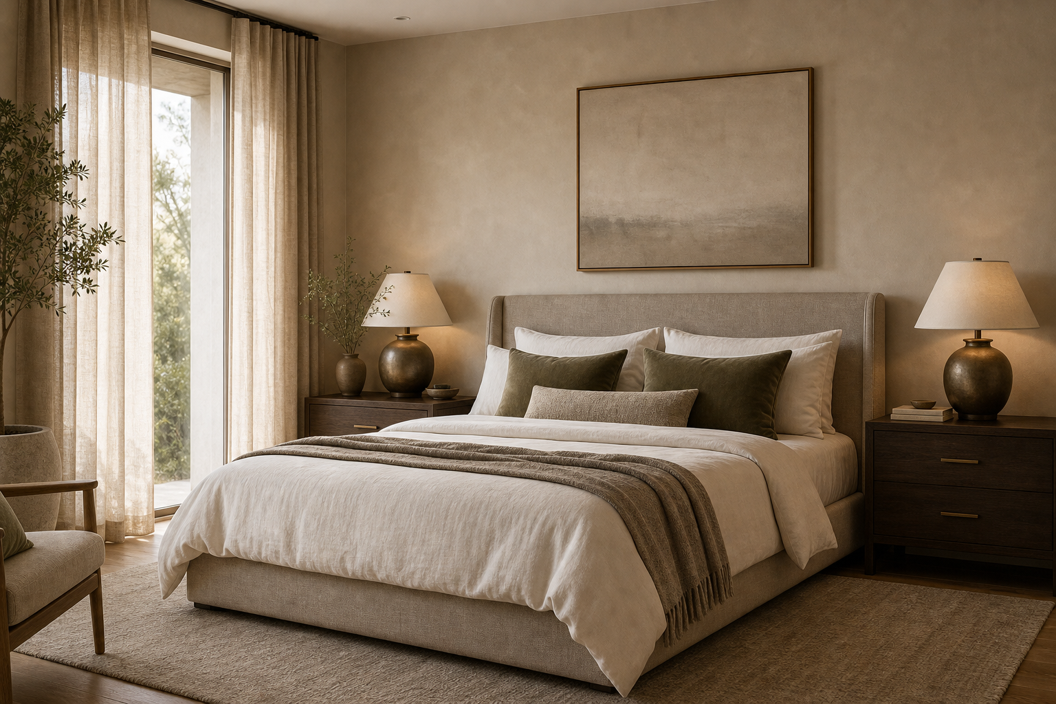

This bedroom is a color lesson in restraint. Warm greige walls wrap the room, ivory bedding keeps the bed bright, and taupe layers prevent the palette from looking flat.
The darker walnut-toned nightstands are the move that gives the room weight. Without them, the bed, curtains and rug could blend into one pale wash.
Greige Walls Make the Ivory Bedding Feel Deliberate
The wall color is not a random beige. It has enough gray in it to make the ivory bedding look crisp, but enough warmth to avoid a cold hotel effect.
That balance is the core of quiet luxury color. The contrast is subtle, yet the bed still separates clearly from the wall behind it.
Dark Nightstands Stop the Room From Floating
The walnut-toned bedside pieces are small compared with the bed, but they do essential visual work. They anchor the lower corners and keep the light bedding from feeling weightless.
Many neutral bedrooms fail because every piece is pale. This one uses darker wood sparingly, which gives the palette depth without making the room heavy.
Muted Olive Pillows Add Color Without Noise
The olive pillows are the only real color accent, and that is why they succeed. They are muted enough to belong with greige and taupe rather than shouting over them.
If you copy one color decision from this bedroom, copy that restraint. One quiet accent can do more than five competing decorative colors.
The Taupe Throw Bridges Bed and Wall
The throw at the foot of the bed sits between the ivory bedding and the greige wall tone. It keeps the transition soft and makes the bed feel layered rather than stark.
A throw in this palette should not be too bright or too patterned. Its job is to add depth, not become the first thing noticed.
Bronze Lamps Warm the Bedside Corners
The bedside lamps bring a gentle metallic warmth that suits the darker nightstands. They add polish without pushing the bedroom into glamour.
That is an important distinction. Quiet luxury usually looks best when metal appears in small doses, especially near lighting.
Linen Curtains Keep the Window Soft
The curtains filter daylight instead of framing the window with a hard edge. Their fabric texture belongs with the bedding and rug, so the whole room feels tactile.
Curtains are often treated as an afterthought in bedroom color planning. Here, they are part of the palette, not just a privacy layer.
The Artwork Refuses to Overperform
The abstract piece above the bed is quiet enough to stay in the background. It adds a finished note without introducing a loud color that would disturb the bedding story.
That is the right call for this room. The palette is already the point, so the art should deepen it rather than redirect it.
What Homeowners Usually Get Wrong With Neutrals
The biggest mistake is choosing only light colors and expecting the room to feel expensive. Without dark wood, bronze or muted green, a neutral bedroom can look unfinished.
Another mistake is adding contrast too aggressively. Black lamps or bright accent pillows would break the soft color temperature that makes this room feel restful.
The Editorial Lesson
This bedroom proves that quiet luxury is not about removing color. It is about reducing the palette until every shade has a reason to be there.
Greige, ivory, taupe, walnut, bronze and muted olive all appear in specific places. That precision is what makes the room feel considered.
The Bedside Lamps Are Small but Decisive
The lamps do not dominate the room, yet their warm glow changes the palette. Bronze and soft light make the dark bedside tables feel intentional instead of heavy.
This is a good reminder for neutral bedrooms: lighting color affects paint and bedding. A cool lamp would make the greige wall look flatter and less inviting.
The Curtains Extend the Wall Color
The curtain fabric sits close to the wall tone, which lengthens the room visually. Instead of framing the window in contrast, the curtains let daylight arrive softly.
That choice keeps attention on the bed. In a quiet luxury room, window treatments should often deepen the palette rather than announce themselves.
Sampling Greige Beside the Bed
Test greige paint beside the bedding, not on an empty wall. This room depends on the wall color making ivory, taupe and walnut look connected.
View the sample with both daylight and lamp light. If the wall turns too gray at night, the room will lose the warm quality that makes this bedroom appealing.
The Pillow Count Stays Under Control
The bed uses pillows for color, not for excess volume. Muted olive appears as a measured accent instead of becoming a pile of decorative cushions.
That restraint is part of the luxury. Too many pillows would make the bed feel fussy, while this arrangement keeps the palette crisp and restful.
A Budget Path to the Same Palette
Start with ivory bedding, then add one taupe layer and one muted olive accent. Those three changes can shift a plain neutral bedroom toward the same mood quickly.
If the nightstands are already dark, keep them. The photograph proves that a little weight beside the bed can make pale textiles look more expensive.
What the Photograph Gets Right About Contrast
The contrast is concentrated at the bedside rather than spread evenly across the room. Dark nightstands, bronze lamps and muted pillows give the bed structure while the walls and curtains remain soft.
That is why the space feels calm but not empty. The eye has a few darker places to land, then returns to the ivory bedding and greige wall.
Homeowners often add contrast through black frames, black lamps and sharp-edged decor all at once. This bedroom takes a quieter route by using dark wood and warm metal instead.
The result is more restful. Nothing in the palette feels accidental, and the bed remains the center without needing a dramatic headboard or bright artwork.
Even the art above the bed respects that decision. Its pale surface keeps the wall finished, but it does not introduce a new color that would pull the bedroom away from greige, ivory and taupe.
That restraint makes the lamps and nightstands feel more important. The darker pieces can anchor the room because the wall art stays quiet.
If the room needs one more layer, choose texture before another color. A heavier linen, softer rug or better lamp shade would fit the palette without changing its quiet bedroom mood.
Common Questions
What colors work for a quiet luxury bedroom?
Warm greige, ivory, taupe, dark wood, bronze and muted olive work well when repeated through real materials.
How do you keep a neutral bedroom from looking boring?
Add depth with darker wood, layered textiles, warm lamps and one muted accent color.
Is olive green good in a neutral bedroom?
Muted olive works well because it adds color without disrupting a greige and ivory palette.
What should be updated first?
Start with bedding and pillows, then adjust lamps and curtains to match the same color temperature.