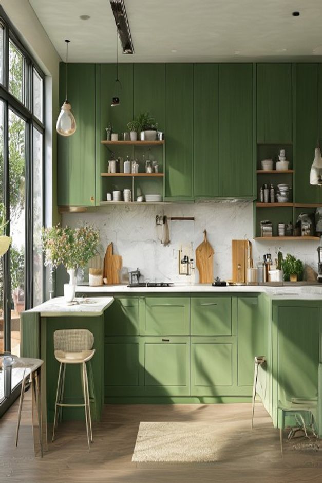
The green cabinetry is not a small accent; it forms almost the entire rear elevation and continues onto the lower peninsulas. Tall flat panels rise to the ceiling, giving the room a composed architectural envelope. Open shelf niches interrupt that color at selected points, introducing warm horizontal lines and visible storage without weakening the cabinet field.
Pale counters and a lightly veined backsplash create a bright working band through the center. Full-height glazing on the left supplies strong daylight, which reveals subtle differences across the green fronts. Two slim stools and sparse plants keep the foreground permeable, allowing the color to remain dominant rather than crowded by furniture.
Tall Green Panels Create a Continuous Background
Broad cabinet fronts extend almost from counter to ceiling with minimal visible hardware. Their vertical joints establish a measured rhythm behind the work zone. Using one deep green tone across this large area makes the rear wall read as architecture rather than a collection of separate upper cupboards.
The color remains visually stable because door sizes are generous. A greater number of small panels and handles would break the surface into busy fragments and reduce the impact of the green field.
Upper panels stop at a shared counter line, creating a clean transition to the pale backsplash. That alignment is more important than perfect symmetry because shelf openings occur at different widths. The consistent lower edge allows the varied upper composition to remain calm.
Open Shelf Niches Relieve the Cabinet Mass
Wood-toned shelves appear within several narrow openings, carrying pale vessels, bottles, and plants. Their warm edges contrast with the green panels and make the niches appear deeper. Each opening remains modest in width, so storage never dissolves the overall cabinet envelope.
Objects are grouped loosely with background visible around them. This editing allows the shelf geometry to perform most of the work; the contents remain supporting detail rather than a competing display wall.
A Pale Backsplash Forms the Working Horizon
The backsplash runs beneath the upper cabinetry in a light surface with visible gray veining. Its exact material cannot be confirmed, but its role is clear: it reflects window light and separates green base cabinets from green panels above.
Cutting boards, small containers, and plants sit along the counter while much of the pale surface stays visible. That open band is necessary in such a saturated room because it provides visual rest at standing height.
A simple rail and a few hanging tools occupy the pale backsplash without filling it. Their narrow dark lines add function at hand height while preserving most of the bright surface. The arrangement avoids another shelf that would interrupt the long working horizon.
Two Projections Define Separate Edges
A short counter projects from the left near the glazing, while a larger green base enters from the right foreground. Both use pale tops, but their different depths create an asymmetrical working enclosure around the center. The open middle remains clearly readable between them.
A published Scandinavian kitchen island study uses a lighter timber palette. This kitchen shows how pale worktops can perform the same clarifying role against a much deeper cabinet color.
The left projection sits close to the glazed wall and receives the strongest daylight, while the right base appears deeper and more shadowed. Repeating the same green across both pieces lets their unequal positions feel intentional. The pale tops provide a common reference line between them.
Slim Stools Avoid Adding Another Heavy Color Block
One pale woven-looking stool stands at the left projection and a narrower metal-framed seat appears near the right. Their open legs reveal the floor and keep both counter edges accessible. Matching bulky stools would add unnecessary mass in front of the green cabinetry.
Daylight Makes the Green Read as Dimensional
The tall left glazing sends moving shadows from exterior foliage across the cabinet fronts. Some panels appear darker while others catch direct light, preventing the color from reading as a flat painted backdrop. The pale backsplash and floor return that brightness into the room.
The transferable approach is to use deep color on one coherent cabinet system, then cut into it selectively with open warm shelves and a continuous pale working band. Keep stools and accessories visually light so the cabinetry remains the room's decisive design move.