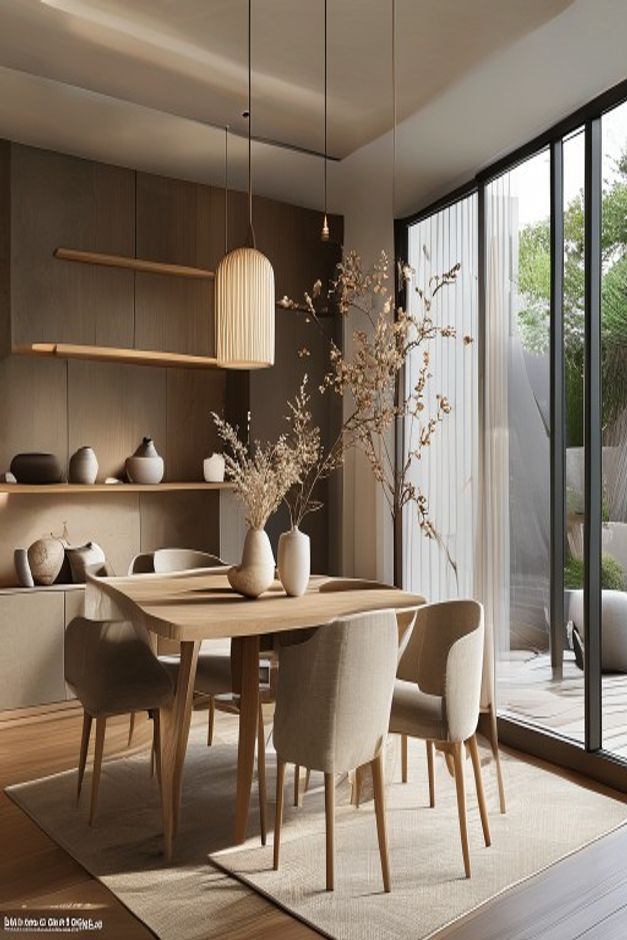

The centerpiece works because it is scaled to the architecture, not merely to the tabletop. Tall branching stems rise into the open volume between a ribbed pendant and the full-height glazed wall. Their irregular outline animates the calm dining room while leaving enough transparency for daylight and the outdoor view to remain part of the composition.
Three pale vessels are distributed along the center of a light wood table rather than grouped into one dense bouquet. Upholstered chairs, a quiet rug, and low display shelves form a neutral background. The result captures a Japandi preference for natural form and visual editing without turning the table into a sparse still life that feels unusable.
Branching Stems Occupy Height Without Creating a Visual Wall
The tallest stems are fine and widely spaced, so the arrangement has volume but remains permeable. This is important at a dining table, where a solid floral mass would obstruct views across the surface. The branches also echo the vertical garden elements visible beyond the glazing.
A shorter dried arrangement stands nearby, creating a stepped profile rather than one symmetrical peak. That variation feels deliberate because both displays share pale, desaturated tones. The eye moves between them while the centerline of the table stays recognizable.
Ceramic Vessels Keep the Base Visually Quiet
The vases are simple and light-toned, with small differences in height and width. Their matte-looking surfaces relate to the muted wall and upholstery. None carries strong pattern, which allows the branches to supply the detailed silhouette above.
Spacing between the vessels leaves parts of the wood top visible. Those intervals are functional as well as aesthetic, preserving room for place settings and shared dishes. A successful dining centerpiece should acknowledge how the table is used, rather than occupying every available inch for display.
The Pendant and Centerpiece Share the Upper Volume
A tall ribbed pendant hangs slightly to the left of the floral arrangement. Its rounded rectangular shade is visually solid, while the branches are open and irregular. The two forms balance one another without becoming a matched pair.
The pendant is low enough to relate to the table but does not descend into the branch structure. That separation should be planned before choosing vase height. When light and centerpiece compete for the same vertical zone, both lose clarity and diners inherit an awkward obstruction.
Pale Wood Connects Table, Chairs, and Shelving
The table's rounded corners and tapered legs soften the strict window grid. Chair legs repeat the same warm wood family, while beige upholstery adds a padded layer around the perimeter. A low rug defines the dining footprint without introducing a contrasting pattern.
Built-in shelves on the rear wall display a small number of ceramics at low height. Their restrained arrangement supports the table setting instead of creating another busy focal point. The use of solid wood can be compared with this modern organic dining room table study, though the present scene is lighter and more minimal.
Daylight Gives the Neutral Palette Its Range
The glazed wall brings strong side light across the tabletop, chair backs, and textured rug. Warm beige surfaces become brighter near the window and deeper toward the shelf wall. That natural gradient supplies contrast in a room with very little color variation.
The arrangement needs no additional accent color to feel complete. Its impact comes from the height of the stems, the empty space between branches, and the relationship to the pendant and window. Keeping the table usable and the view open is the discipline that makes the centerpiece convincing.
Rounded Corners Make the Dining Group Easier to Approach
The tabletop and upholstered chair backs use softened corners, easing movement around a group positioned close to the glazed wall. These curves offset the hard mullions and long rear shelves. They also make the central arrangement feel less formal despite its careful alignment.
Chair spacing leaves visible gaps on every side, so the seats can be pulled back without immediately meeting another object. That breathing room is essential to the serene effect. A larger table would compromise the light perimeter that currently separates furniture from architecture. The near corner remains particularly open, giving the camera-side approach a credible entry into the group.