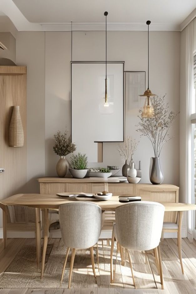

The sideboard does more than provide a surface behind the dining table. Its long, low profile establishes a quiet horizon across the rear wall, giving a collection of pale vessels and branches enough structure to read as one composition. Two overlapping frames rise above it, shifting the wall away from strict symmetry without making it feel unresolved.
Light wood, cream upholstery, taupe walls, and soft daylight create the California casual character. The room remains useful because the styling stays close to the sideboard and does not spill into the dining zone. Table, chairs, pendant cords, and the large right window each retain a separate visual layer.
The Sideboard Is Scaled to the Dining Table
The cabinet is almost as long as the table in front of it, creating a stable relationship between storage wall and eating surface. Its top sits below chair-back height, so objects remain visible without forming a tall barrier. Fine horizontal lines across the front emphasize length and keep the pale timber from looking bulky.
The sideboard begins beyond the end of the dining table and continues almost to the window edge. That generous width lets the wall composition breathe horizontally. A shorter cabinet would force frames, vessels, and branches into a tight central pile, weakening the relaxed scale that defines this room.
Overlapping Frames Create Controlled Asymmetry
A large black-edged frame occupies the center, while a narrower frame slips behind its right edge. Their pale interiors keep the overlap subtle, and the vertical proportions counter the long cabinet below. The arrangement feels intentional because both frames share a common lower zone rather than floating at unrelated heights.
The larger frame also sits behind one pendant cord, adding depth to an otherwise flat wall. That crossing is visually delicate; a heavily patterned artwork would make the cord look accidental. Here, thin lines and quiet fields allow furniture, light, and art to coexist.
Frame edges overlap without sharing a perfect baseline. One pale image sits slightly forward, while the darker outline behind extends the composition upward. The offset looks deliberate because surrounding objects remain low. If every accessory reached the same height, the asymmetry would lose its controlled focal point.
Vessels Are Grouped by Height and Empty Space
Low bowls occupy the center of the sideboard, medium rounded vessels gather to the right, and taller branches rise at both ends. The repeated gray-beige finishes hold the pieces together even though their shapes differ. Clear gaps remain between groups, preventing the surface from becoming a continuous decorative shelf.
Branches Extend the Composition Without Adding Mass
Fine stems on the right reach into the upper frame area and balance a denser leafy arrangement on the left. Their open silhouettes let the wall color remain visible. A solid lamp or tall opaque vase in both positions would make the rear elevation feel much heavier.
The Dining Set Stays Visually Lighter Than the Cabinet
The table uses slim tapered legs and a relatively thin top, while the upholstered chairs stand on narrow wood-toned frames. These open supports preserve sightlines to the sideboard. The pale chair backs also form a soft foreground without competing with the vessels immediately behind them.
A related balance between wood and upholstered seating appears in this published modern organic dining table study. The present room adds a styled storage wall, but the same principle applies: furniture legs and chair scale should keep daylight moving through the lower half.
Three Pendant Drops Mark the Room's Depth
Slender cords descend at different positions above the table, with small shades that do not block the frames. Their dark lines introduce a precise counterpoint to the soft palette. Because the fixtures are narrow, they register as a rhythm rather than one dominant chandelier.
Side Daylight Keeps the Neutral Palette Alive
The tall window at the right sends strong light across the chairs, table, and sideboard, producing varied shadows on similar pale surfaces. This changing contrast is what prevents the room from appearing washed out. Full-height curtains soften the glass edge without cutting off the bright vertical opening.
The wall would lose clarity if every sideboard object were centered or matched. Its appeal comes from one stable cabinet supporting uneven frames, varied vessel heights, and loose branches. The transferable rule is to build a strong horizontal base, then leave enough wall visible for asymmetry to feel deliberate.