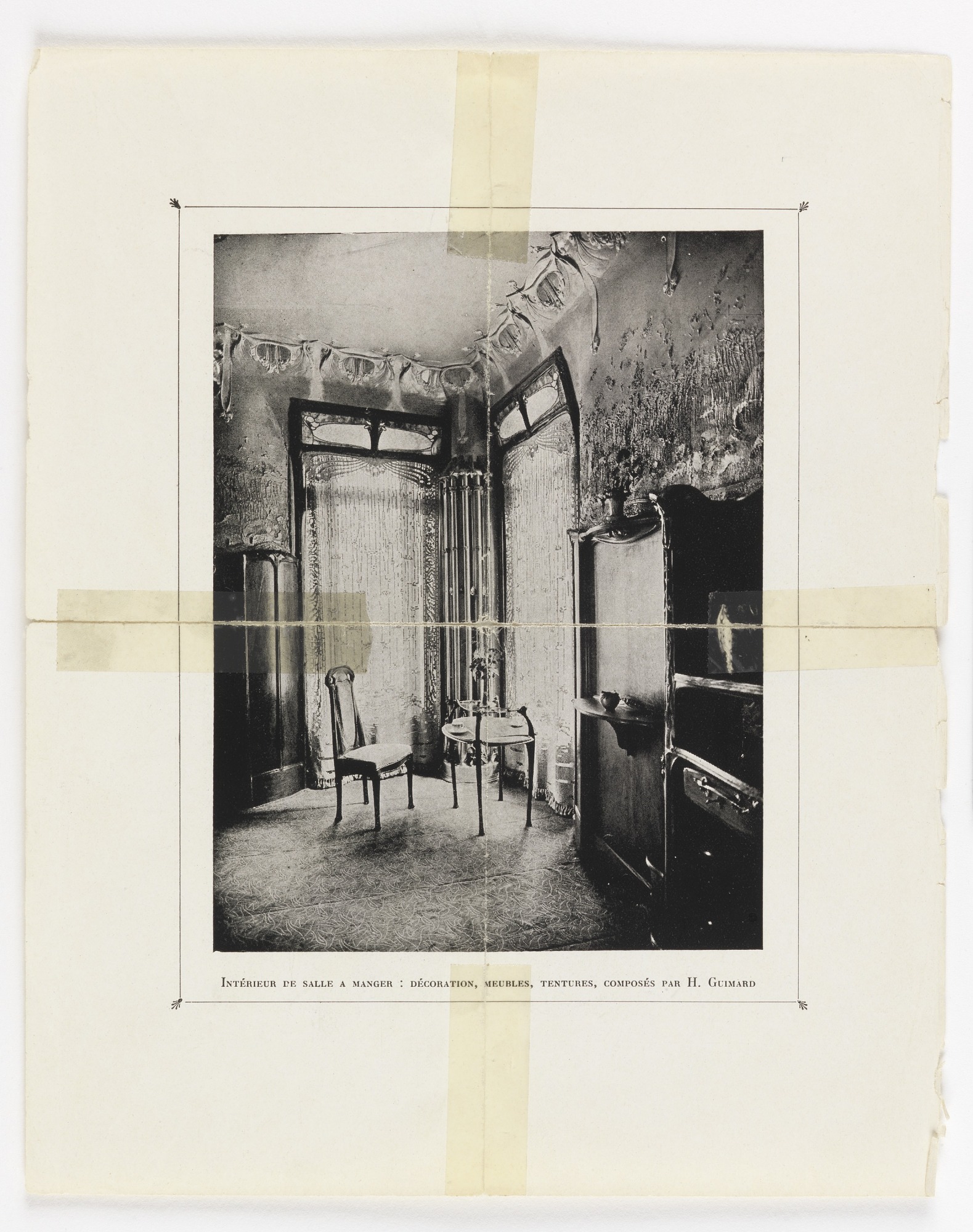

This archival photograph is worth studying precisely because the interior is so compressed. Two tall, curved partition-like elements frame a tiny dining setting, drawing the eye through layered thresholds rather than across an open-plan room. A small round table and two slender chairs occupy the center, leaving the surrounding walls and fitted forms to carry most of the visual drama.
The black-and-white reproduction limits confident material and color identification, so proportion, outline, and spatial sequence are the reliable evidence. Curving upper rails, decorative glazing, patterned wall surfaces, and a continuous floor motif create a total composition. The lesson is not to copy an unverified finish; it is to understand how repeated lines can make a small dining area feel intentionally enclosed.
Curved Partitions Turn a Tight Corner into a Destination
The two tall frames bend inward near their upper edges and create a sheltered bay around the table. They do not form a simple rectangular doorway. Their asymmetrical positions make the viewer look from one curved outline to the next, giving the shallow interior a surprising sense of procession.
Because both partitions include lighter translucent-looking panels, they divide space without reading as opaque walls. The photograph cannot prove the glazing type, yet the contrast shows that light passes or reflects differently through those areas. This visual permeability is what keeps enclosure from becoming confinement.
A Tiny Round Table Fits the Available Geometry
The table is narrow enough to sit between two chairs without touching the surrounding frames. Its circular top avoids corners in an already irregular plan and leaves small routes around the setting. A larger rectangular table would challenge the curved boundaries and make the bay feel like furniture had been forced into leftover space.
The top holds only a few small items, so its outline remains readable. That restraint is practical as well as visual. In a compact dining niche, preserving a clear perimeter around plates and hands matters more than using the center as a permanent display platform.
Slender Chairs Preserve Views of the Floor and Walls
Both chairs have fine legs and narrow backs, allowing patterned floor and wall surfaces to continue around them. Their visual lightness counters the elaborate surrounding envelope. Upholstered or solid-backed seats of greater mass would obscure the lower composition and reduce the perceived breathing space around the table.
The chairs are not placed in perfect mirror symmetry. One turns slightly, acknowledging the route into the bay. That small adjustment makes the setting feel usable and demonstrates how circulation can modify a formal composition without dismantling its central focus.
Pattern Extends Across Surfaces Without Relying on Color
A dense motif appears on the floor, while walls and upper borders carry their own repeated marks. In monochrome, those surfaces are distinguished by scale and direction rather than hue. The floor pattern spreads horizontally; the wall treatment rises more vertically; and the curved frames provide the strongest outlines between them.
This layering could become overwhelming in a larger furniture arrangement. Here, the small table and spare chairs act as quiet intervals. The room shows that ornament is most convincing when the useful objects remain simple enough to reveal it, rather than competing with another set of intricate silhouettes.
The Right-Hand Fitted Forms Add Depth at the Edge
Large dark furniture-like forms occupy the right side, including a tall curved front and a lower projecting surface. Their exact functions are uncertain and should not be invented. Visually, they create a heavy edge that pushes the lighter dining group toward the illuminated center of the photograph.
An Archival Image Demands a Different Kind of Design Reading
Tape, paper borders, printed captioning, and age marks are visible around the photograph. They are part of the asset and make clear that this is documentation, not a contemporary room photograph. Any editorial use should preserve that distinction rather than presenting uncertain tones as current paint or product recommendations.
What transfers to a present-day small dining room is the spatial logic: define a curved or translucent threshold, keep the central furniture compact, and allow patterned enclosure to do more work than accessories. The image proves that intimacy can come from articulated boundaries, provided the furniture leaves those boundaries visible.
The narrow printed border around the photograph further separates documentation from room content. Reading that boundary honestly prevents paper tone, tape, and reproduction marks from being misidentified as finishes inside the dining space.