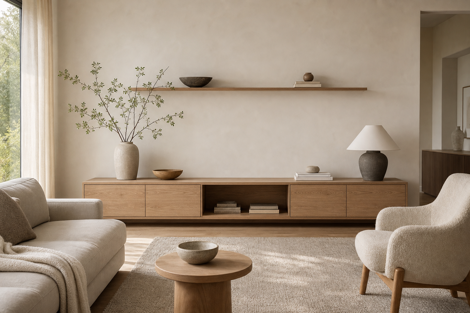

The media console is almost as long as the main wall but remains low enough to leave most of that elevation empty. Flat timber-toned doors conceal storage, while one dark open bay marks the center beneath a thin display shelf. A pale sofa, rounded lounge chair, small circular table, quiet rug, and side window form a soft foreground. Minimalism here is achieved through proportion and concealed volume, not absence of function.
The Console Establishes a Low Horizontal Datum
The console is long and low, which immediately stretches the wall visually. That horizontal proportion is the reason the room feels calm: the eye travels across the cabinet before it moves up to the shelf or over to the seating. A taller cabinet would have made this wall feel heavier. Here, the low height leaves enough pale wall above the console for the room to breathe, while the closed doors keep the storage function quiet.
The cabinet stretches beyond the seating center and stops before the side opening, giving it architectural scale without becoming a full built-in wall. Its low top allows branches and one lamp to rise against a broad quiet background.
The slim floating shelf gives the broad pale wall a second line without turning it into a display wall. Its restraint matters because the console already provides the stronger base. Only a few objects sit on the shelf: a dark bowl, stacked books and a small ceramic vessel. That spacing keeps the wall edited, which is exactly what warm minimalism needs.
The single dark recess is narrower than the surrounding closed doors and sits close to the middle. That controlled interruption identifies equipment storage without exposing an entire row of devices, cables, or shelves.
A Slim Shelf Uses the Wall Without Filling It
The pale sofa and rounded pale lounge chair do not compete with the console's clean geometry. Their rounded cushions and textured fabric soften the room without adding pattern. This is a useful design move for homeowners: when the storage wall is linear, choose seating with a softer edge. The contrast makes the room more comfortable and prevents minimalism from feeling rigid.
Rounded Seating Counters the Cabinet Geometry
The round timber-toned coffee table is small but important. It interrupts the strong horizontal lines of the console and shelf, giving the seating area a gentler center. Because the table repeats the light timber-toned tone, it connects back to the console rather than becoming a separate accent. The shape changes, but the material relationship stays controlled.
The published built-in shelving living-room analysis places storage vertically around a focal wall. This room takes the opposite approach, concentrating function near the floor so upholstered curves and empty wall remain dominant.
The Circular Table Holds the Conversation Zone
Daylight enters from the left side, washing across the rug, seating and console front. That side light reveals the timber-toned surface and fabric texture without needing dramatic overhead fixtures. The sheer curtain also matters. It filters the brightness at the window edge, so the room feels soft rather than stark.
Side Daylight Separates Similar Pale Tones
The palette stays close: warm ivory pale wall, light timber-toned, greige upholstery and cream textiles. None of those colors shouts, but together they create enough variation for the room to feel layered. The branches in the ceramic vase add the only clear green note. Because that color appears in a natural, delicate form, it freshens the room without breaking the minimalist discipline.
Light enters from the left and grazes cabinet fronts, upholstery, and rug in sequence. The image supports a soft tonal hierarchy but not exact fabric fibers or timber species, so those labels are intentionally avoided.
Sparse Objects Preserve Usable Surface
Start with the console, not the accessories. The best version should be long enough to feel architectural, low enough to preserve wall space above it and simple enough that the storage doors read as one continuous plane. After that, add only one upper line, such as a thin shelf, and keep the objects sparse. A vase, a shallow bowl and a small stack of books are enough when the wall itself has good proportion.
Sizing Storage Before Styling the Wall
I would avoid placing tall shelving on both sides of this console. The room's strength is the long, quiet wall, and vertical storage would make the composition feel busier. I would also keep the rug plain. A high-contrast pattern would pull attention away from the subtle relationship between the console, pale wall and soft seating.
Begin with the required enclosed volume and the wall's available length. Once the cabinet establishes a calm base, add only the upper line and objects needed to balance it. Tall flanking units would erase the room's most convincing spatial quality.
The console doors repeat in broad widths and use no prominent handles, letting their slight tonal change supply the only lower-wall rhythm. A branch vessel rises at the left while a lamp closes the right end; neither object occupies the central media recess.