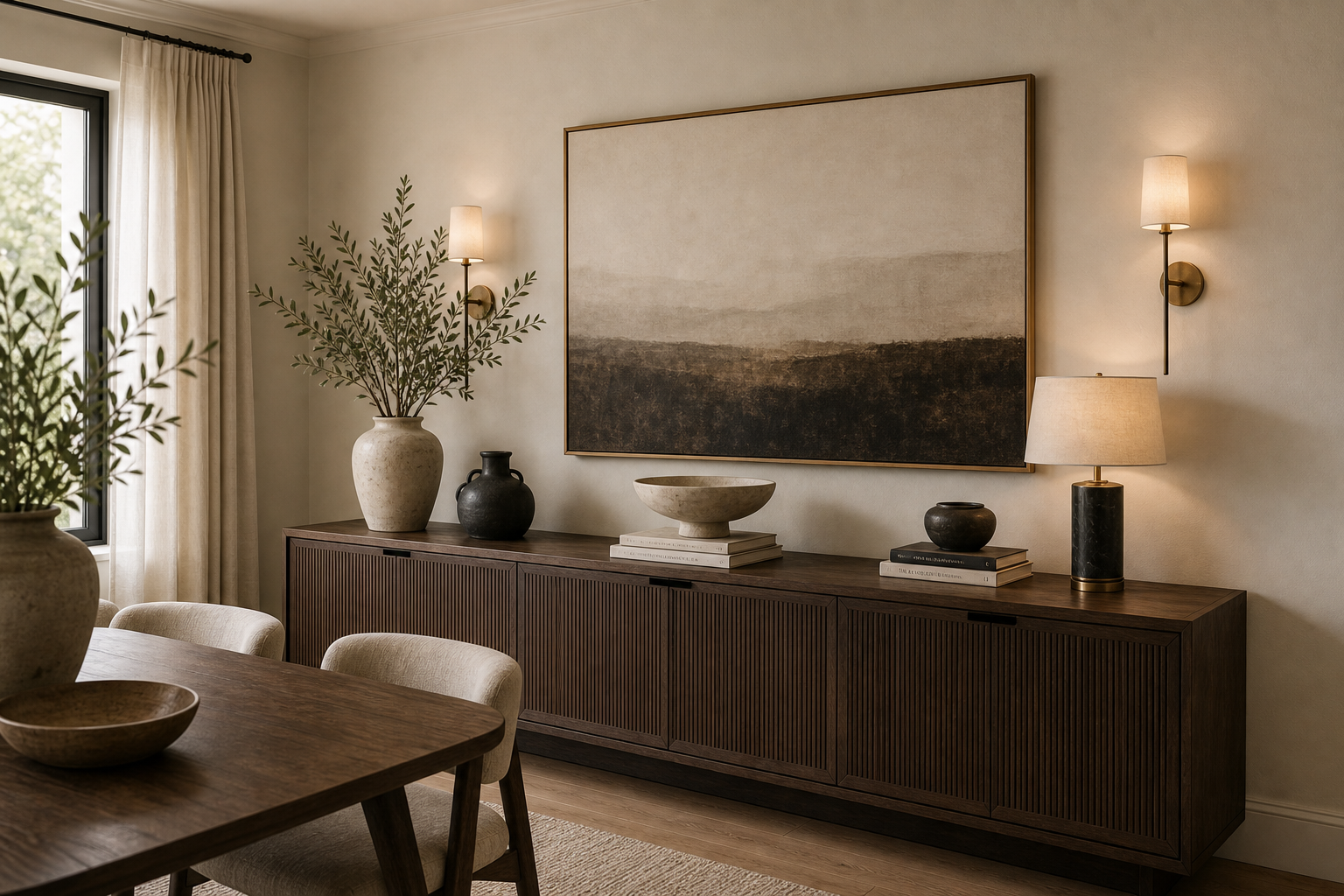

The sideboard succeeds because it is treated as the base of a complete wall elevation, not as an isolated surface waiting to be filled. A long dark cabinet establishes the lower horizontal line, a broad landscape occupies the center above it, and paired sconces mark the outer limits. The styling between those fixed points stays low enough to preserve the artwork's authority.
Asymmetry gives the composition life without disturbing its balance. A shaded lamp rises at the right, a tall pale vessel and branches lift the left edge, and smaller bowls, books, and dark pottery settle across the middle. The objects differ in height and finish, yet their combined visual weight remains evenly distributed along the cabinet.
The Cabinet Sets the Width of the Composition
The sideboard extends beyond the landscape on both sides and nearly reaches the two wall lights. Its broad top therefore acts like a plinth for the entire arrangement. Closely spaced vertical fluting runs across the fronts, giving a dark piece texture without breaking it into busy color changes. Slim feet lift the cabinet just enough to separate its mass from the floor.
The cabinet's height is equally important. Its top sits well below the dining chair backs in the foreground sightline, leaving a broad wall interval for art and light. A taller hutch would divide the landscape and reduce the visible panel of plaster-like wall around it. The present proportion treats the sideboard as a low architectural base, which is why several objects can sit on top without making the entire elevation feel top-heavy or crowded at eye level.
Large Art Creates a Stable Center
The landscape is wider than any object below and hangs with a generous margin above the sideboard. Its pale upper field relates to the wall, while the darker lower band visually returns to the cabinet. This tonal bridge is more important than matching individual accessories. Because the picture already establishes scale, the surface does not need a gallery of smaller frames competing around it.
Paired Sconces Define the Outer Boundary
Two compact shaded sconces sit beyond the artwork rather than directly above the cabinet corners. Their warm pools reveal the textured wall and make the arrangement legible after daylight fades. The right-hand table lamp adds another, lower source instead of imitating the sconces. Exact color temperature cannot be established, but the visible layering prevents the wall from relying on one flat overhead light.
Objects Are Grouped by Silhouette, Not Spread Evenly
At the left, a tall branch vessel is paired with a smaller dark pot. Near the center, a shallow pale bowl sits in front of the landscape, while books and rounded vessels form compact groups toward the right. Empty stretches remain between them. This spacing allows the fluted top edge to stay visible and gives each silhouette a clean outline against the wall.
The dining table in the foreground carries only a broad low bowl and a branch vessel, echoing the sideboard without copying its arrangement. That restraint keeps the two horizontal surfaces from competing. The related warm neutral dining table study uses a more sculptural central table; here the stronger editorial moment remains on the back wall.
Nothing on the surface forms a continuous row. The pale bowl projects forward near the middle, the lamp is set back toward the wall, and the branch vessel rises from the opposite end. This difference in depth is subtle but useful: it prevents the display from appearing as a line of products arranged along a shelf. From the dining table, foreground and background objects overlap slightly, giving the cabinet top a lived-in sense of depth while retaining clear negative space.
Muted Materials Let Form Carry the Detail
Dark ribbed cabinetry, pale ceramic forms, timber table surfaces, neutral upholstery, and softly textured plaster-like walls occupy a narrow color range. Contrast comes from profile: round pots against straight fluting, a soft lamp shade against the rectangular artwork, and leafy branches against the long cabinet. The room feels contemporary because objects are selected for shape and proportion rather than decorative motif.
Curtains at the side remain full height and pale, providing a soft vertical boundary that does not compete with the cabinet's dense horizontal fluting.