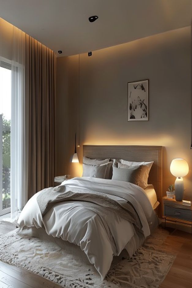

The bed occupies most of this compact bedroom, and the plan is stronger for admitting that fact. Rather than forcing a second function into the remaining floor area, the design centers the sleeping zone on the rear wall and uses the slim edges for light and minimal bedside support. The result is focused, calm, and easy to read.
Lighting supplies much of the architecture. A warm line washes the wall behind the headboard, another glow traces the ceiling perimeter, and small black fixtures punctuate the room at different heights. These layers give depth to a restrained brown, gray, and white palette without requiring additional furniture or a busy feature wall.
The Bed Claims the Width Without Blocking the Window
The bed is positioned slightly away from the tall glazing on the left, leaving a narrow but visible strip of floor and curtain. This clearance is enough to preserve the vertical window line and allow daylight to reach the bedside. Pushing the mattress tighter against the glass would make both the bed and curtain feel compressed.
At the foot, the duvet falls loosely but the route remains open in the foreground. There is no bench or chest narrowing that approach. In a small bedroom, keeping the foot zone uncomplicated is often more useful than adding a secondary piece that can be reached only by squeezing around it.
A Broad Headboard Stabilizes the Sleeping Zone
The wood-toned headboard extends beyond the pillows and forms a clear horizontal base against the warm gray wall. Its shallow depth gives the bed architectural presence without consuming the floor space of a thick upholstered surround. A thin illuminated line above makes the width appear even more intentional.
Asymmetrical Bedside Lighting Solves Unequal Edges
A dark pendant drops near the left side of the headboard, while a rounded table lamp glows on the right nightstand. The fixtures differ in form and mounting, but their warm output balances the two sides. This is more responsive than forcing identical lamps into spaces that do not have identical widths.
The right nightstand remains narrow and low, with one visible drawer and little surface clutter. On the window side, the pendant frees the limited support surface below. The room demonstrates that functional symmetry can come from equal light and reach, not necessarily matched objects.
Curtains Turn the Glazed Wall into a Soft Boundary
Heavy brown curtains begin at the ceiling and fall beside a sheer inner layer. The darker folds absorb some of the bright window contrast and visually extend the rear wall around the bed. Concealed light at the ceiling catches their upper edge, emphasizing height while leaving the fabric face relatively quiet.
This treatment is especially useful in a compact plan because the fabric performs several roles without projecting far into the room. It controls glare, adds texture, and softens the corner. The high-hung strategy also appears in our warm neutral bedroom curtain study, although this room uses deeper color for a more nocturnal effect.
A Limited Palette Clarifies the Layers
White bedding creates the brightest mass, the headboard and floor supply warm wood tones, and gray-brown walls and textiles form the middle range. Black ceiling and pendant details are used as small points rather than broad planes. This distribution helps the bed stand out without introducing a conventional accent color.
A small framed artwork above the headboard stays within the neutral range and occupies only a narrow portion of the broad wall. Its light field echoes the bedding, while the dark frame relates to the ceiling spots and pendant. The restrained scale keeps the illuminated headboard line, rather than the picture, as the dominant wall gesture.
The Rug Softens the Landing Without Hiding the Floor
A textured pale rug extends beyond the bed and into the foreground, cushioning the main walking and standing area. Its irregular pattern is visible but low contrast, so it does not compete with the loose duvet folds. A border of wood flooring remains exposed at the right, keeping the room's width legible.
The layout could easily become congested if additional storage, seating, or oversized lamps were introduced. Its restraint is practical rather than merely stylistic: each side of the bed receives light, the window remains operable in visual terms, and the foot path is protected. Those priorities are what make the small footprint feel designed instead of compromised.