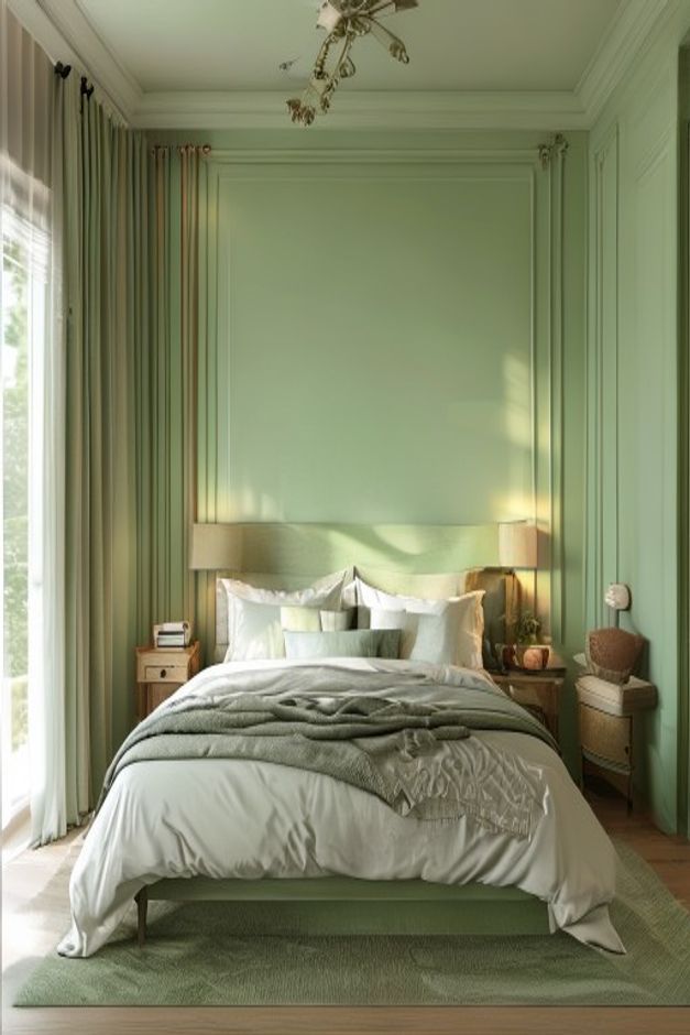

This bedroom demonstrates how a single color can shape an entire interior without erasing depth. Sage green covers the paneled walls and ceiling, then reappears in the curtains, bed base, throw, and rug. The palette is immersive, yet the room remains legible because each surface carries a different texture or level of light.
The bed is centered within a broad framed wall panel, establishing an immediate hierarchy. Crown molding, narrow vertical trim, and the low upholstered headboard all reinforce that axis. Sunlight from the left interrupts the symmetry with moving patches of brightness, which keeps the formal arrangement from feeling static.
Wall Paneling Gives the Green Architectural Depth
A large central rectangle behind the bed is bordered by slender applied moldings, while additional vertical panels continue along the right wall. These shallow changes create shadow lines within the same hue. The eye reads depth and proportion before it reads decoration, so the green feels integrated with the room rather than applied as a fashionable accent.
The broad middle panel is intentionally spare. It gives the headboard and pillows a calm backdrop and lets the molding establish scale without requiring artwork. Filling that field would weaken the color's enveloping effect and compete with the strong daylight pattern already moving across the wall.
Painting the Ceiling Extends the Envelope
The sage tone continues overhead and meets a wide pale-green crown molding. This eliminates a bright white cap that would otherwise shorten the walls and divide the composition. The ceiling still reads as a separate plane because it receives more even light and carries a central decorative fixture.
The decorative ceiling fixture introduces a small metallic and sculptural note without breaking the monochrome field. Its branching form is airy enough that green remains visible around it. A large opaque shade would create a heavy object overhead and weaken the continuous color envelope established by the painted ceiling.
Curtains Reinforce Height Without Becoming an Accent
Full-length curtains hang close to the ceiling along the left opening. Their green is slightly deeper than the sunlit wall, and vertical folds echo the panel divisions. A sheer layer at the glass diffuses direct light, allowing the stronger outer drapery to frame the opening without making it visually heavy.
Coordinating curtains with the wall is useful here because the window occupies almost the full room height. A contrasting fabric would split the left elevation into a separate color block. The quieter approach resembles the tonal discipline in this warm neutral bedroom with linen curtains, although the present scheme uses color rather than beige to unify the perimeter.
White Bedding Creates a Bright Center
The bed carries the only large field of near-white, so it becomes the visual rest point inside the green shell. Layered pillows rise above the low headboard, and their crisp edges keep the central axis clear. A muted green throw lies loosely across the lower half, reconnecting the bedding to the room without covering the light duvet.
Warm wood nightstands on both sides add a modest complementary tone. Their small size prevents the dark accents from breaking the envelope, while shaded lamps introduce soft pools of warm light at pillow height. The furniture is supportive, not the source of the room's identity.
The Rug Anchors Color at Floor Level
A plain green rug extends beyond both sides and the foot of the bed, placing the furniture on a defined soft field. Its low pattern and slightly darker value help the bed base remain distinct. The exposed wood floor around the perimeter acts as a narrow warm border between the rug and paneled walls.
Monochrome Works Because Texture Keeps Changing
Painted molding is smooth, curtains fall in deep folds, bedding is loosely layered, the rug is dense and even, and wood pieces introduce visible grain. Those shifts stop repeated green from becoming featureless. They also make color maintenance more forgiving: small tonal differences read as intentional material variation rather than failed matching.
The main risk would be adding several unrelated greens through decorative objects. This room needs the wall color to remain the stable reference, with textiles staying close and wood providing limited warmth. Its sophistication comes from controlling value and texture, not from searching for ever more shades to prove the palette.