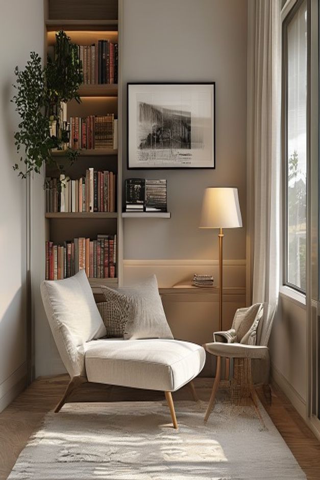

This nook works because it does not ask a shallow corner to behave like a complete library. A slim built-in bookcase occupies only the left strip of wall, leaving room for a low lounge chair, a floor lamp, and a tall window on the right. The limited shelving becomes an architectural accent rather than a storage wall that overwhelms the seat.
The composition is asymmetrical but balanced. Books and a leafy plant create darker density on the left; daylight and pale curtains brighten the right. The chair bridges those conditions in the center, receiving light from both the window and the warm floor lamp without blocking the route along the glazing.
A Narrow Bookcase Makes the Wall Feel Taller
The shelving rises from the baseboard to the ceiling within a slender recess. Warm light is concealed beneath the upper shelves, separating rows of books and giving the vertical strip more depth. Because the unit is narrow, each shelf holds only a modest run of volumes, which keeps the storage visually concentrated.
A trailing plant projects beyond the shelf edge near the top and softens the strict column. Its irregular outline is useful in a wall otherwise defined by straight panel joints, picture frames, and book spines. The plant remains within the shelf zone, so it does not intrude into the sitting area.
The Lounge Chair Preserves an Open Sightline
The pale chair has a low back, open space beneath the seat, and slim angled legs. Those proportions allow the bookcase and wall molding to remain visible around it. A bulkier club chair would provide more enclosure but would also close the lower half of this narrow corner.
The chair faces slightly into the room rather than directly toward the window. That angle makes sitting easier from the open foreground and still allows a sideways view outdoors. Two loose cushions add support without raising the back enough to compete with the framed artwork above.
A Floor Lamp Occupies the Bright Side Deliberately
The floor lamp stands between the seat and window, where its narrow stem takes little floor area. Its shade creates a warm oval against the wall and provides evening light at shoulder height. By placing the lamp on the already bright side, the design keeps cords and a substantial base away from the bookcase access zone.
Wall Art Expands the Nook Beyond the Shelves
A single black-framed print hangs above the chair and fills the broad blank wall between shelving and glazing. Its monochrome image relates to the dark book spines and window frame, while the white mat echoes the upholstery. The artwork is large enough to hold the wall but leaves a clear margin around the lamp shade.
A narrow pale ledge continues beneath the picture and behind the floor lamp. It adds a shallow horizontal line to the wall without becoming a full console. The ledge carries only a small stack, preserving the empty field around the artwork and keeping the sitting area free of another freestanding surface.
The Window Provides Depth the Floor Plan Cannot
Tall glazing on the right draws the eye past the narrow interior and into the outdoor view. Full-length pale curtains soften the frame without covering it. Sunlight travels across the rug, emphasizing the chair's open legs and making the small corner feel less enclosed than its physical footprint suggests.
Window adjacency is handled differently in this rustic modern window-bench reading nook. Here, using a movable chair instead of a built-in bench keeps the arrangement visually lighter and allows the seat angle to respond to changing light.
Small Pieces Must Remain Truly Small
A tiny chair-like or stool-like piece sits beside the lounge chair, and a low ledge runs along the wall behind the lamp. Their exact functions are not certain, so they should not be described as specialized storage. What is clear is their scale: neither projects far enough to compete with the main seat or constrict the foreground.
The nook's strongest lesson is disciplined allocation. One narrow column stores books, one low chair supports reading, one lamp handles evening use, and one window supplies atmosphere. Each element has a distinct visual territory. That separation allows a shallow corner to feel purposeful without relying on oversized joinery or generic decorative layering.