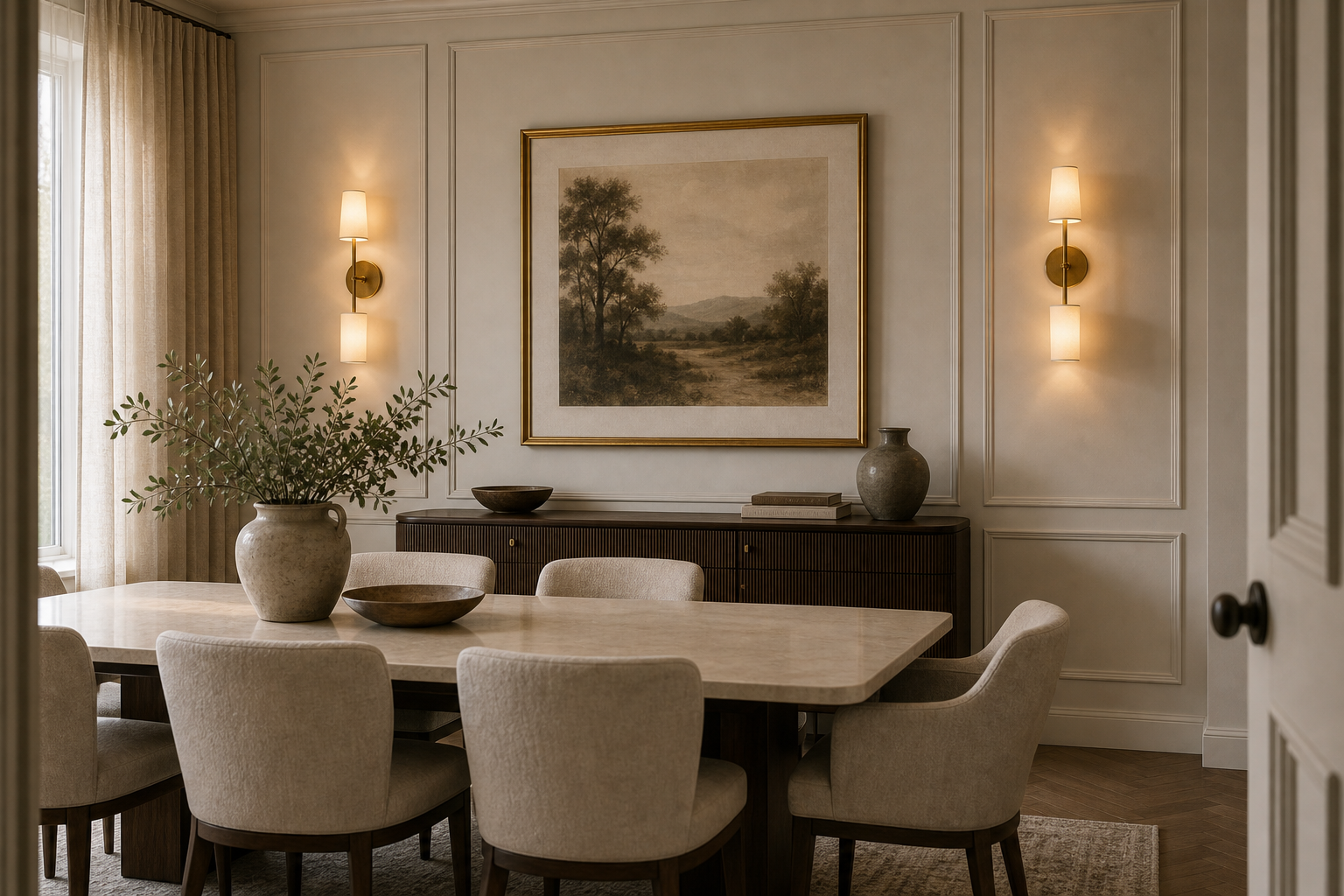

The wall sconces give this dining room a second center of gravity beyond the table. Mounted on either side of a framed landscape, they illuminate the paneled wall above a dark sideboard and create a complete rear elevation. Their warm pools are visible in daylight, so the fittings contribute to depth and symmetry even before they become the room's primary evening light.
The table and chairs remain deliberately quiet in the foreground. A pale rectangular top, rounded upholstered backs, and one broad branch vessel form a low horizontal layer that does not block the lighted wall. This hierarchy allows the room to feel furnished from front to back: seating handles use, while the sconces make the far surface architecturally present.
The Sconces Frame Art Rather Than the Table
Each fitting is centered within a tall panel to the left and right of the landscape. This placement gives the artwork its own illuminated field instead of tying the lights directly to chair positions below. Narrow brass-toned stems and pale cylindrical shades are visually light against the warm wall. Their spacing is broad enough that the picture retains a clear border and does not appear pinched between fixtures.
Panel Molding Gives Every Element an Address
Fine rectangular molding divides the wall into measured bays and continues behind both lights and artwork. The central frame is widest, matching the picture and sideboard, while narrower side panels hold the sconces. Because molding, wall, and trim share one pale color, their hierarchy is revealed through shallow shadow. Strong contrasting trim would compete with the very light it is intended to support.
The Sideboard Grounds the Illuminated Wall
A long dark cabinet sits directly beneath the landscape, providing a stable base for the brighter upper composition. Its top carries low bowls, books, and compact pottery, with a tall branch vessel offset at the left. The surface is not symmetrically styled, which prevents the paired sconces from making the wall feel ceremonial. Solid mass below and warm light above create the balance.
Daylight and Wall Light Reveal Different Depths
Tall glazing and full-height curtains at the left bring broad soft light across the table and chair upholstery. The sconces create smaller halos that expose panel edges and the dark sideboard silhouette. Neither source replaces the other. The photograph supports layered warm illumination, but it does not establish exact fixture output or bulb temperature, so performance specifications should not be invented.
Dining Furniture Stays Below the Main Sightline
The pale table has a substantial top but sits well below the sideboard artwork. Curved chair backs repeat around it at a consistent height, forming a soft foreground rhythm. A low bowl and leafy vessel remain near the table center. This disciplined scale prevents flowers or pendant fixtures from cutting across the wall; no ceiling light is visible in the image and none is needed to explain the composition.
Material Contrast Is Narrow but Precise
Pale upholstery, warm off-white panels, mid-toned flooring, a stone-like table surface, dark timber-toned cabinetry, and brass-toned lights occupy distinct values. The quiet luxury effect comes from that controlled range rather than from glossy ornament. This approach complements the layered-lighting logic in the quiet luxury dining room chandelier study, while shifting emphasis from the ceiling to the room perimeter.
A Wall-Lighting Plan Begins with Elevation
To adapt the idea, compose the wall as one drawing before selecting fixtures. Set the artwork and cabinet axis, establish panel widths, then place each sconce where its shade has clear air from both frame and molding. The room succeeds because lights belong to the architecture rather than filling leftover wall space. Their glow clarifies the elevation and leaves dining activity comfortably secondary after dark.
The framed landscape is hung low enough to relate to the sideboard but high enough that the bowls and pottery do not overlap its detailed center. The sconces occupy the clearer outer panels, where their halos can spread without bleaching the picture surface. This spacing is a useful reminder that wall lights should be coordinated with both frame size and object height below. A technically symmetrical installation can still feel congested if shades, artwork, and surface styling compete in the same narrow band.
Curtain folds at the left echo the panel lines but remain outside the illuminated central wall.