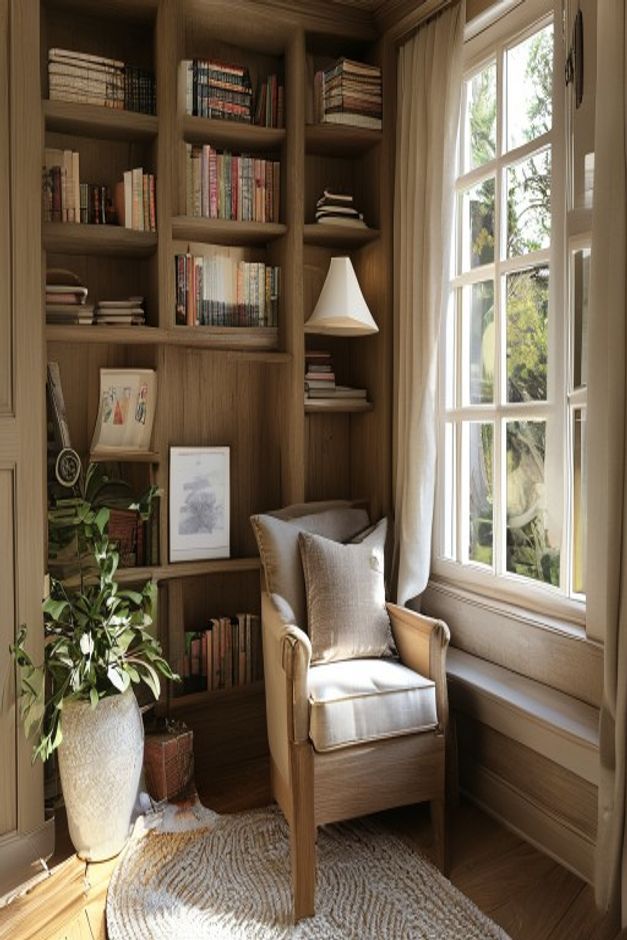

The armchair is not the largest element in this reading nook; the fitted bookcase is. Yet the chair determines how the entire corner is used. It sits between the warm timber shelves and a deep, bright window, positioned to reach books, receive daylight, and remain within the pool of a small pendant lamp.
English country character emerges through accumulated detail rather than a decorative checklist. Books are stacked in different directions, framed pictures lean against the shelves, a leafy plant occupies the lower left, and a textured round rug softens the floor. The architecture contains that variety, preventing the narrow corner from feeling untidy.
A High-Back Armchair Gives the Corner a Clear Purpose
The chair has a straight upholstered back, lightly padded arms, and a visible wood frame. Its proportions are upright enough for reading but softer than a desk chair, and two pale cushions increase support without hiding the seat shape. The warm frame relates directly to the shelving, so the chair feels selected for the alcove rather than moved in temporarily.
Its front legs rest fully on the round rug while the back remains close to the bookcase. That placement leaves the foreground open for entry. Rotating the chair farther toward the window might improve the view, but it would also widen its footprint and make access to the lower shelves more difficult.
Built-In Shelves Use an Irregular Grid
The bookcase rises to the ceiling and varies its bay widths, with a narrower column turning toward the window. Books fill many compartments, but framed pieces and folded textiles introduce pauses. The result resembles a working collection rather than an evenly merchandised wall.
At chair height, a few ledges remain relatively open, allowing the seated area to breathe. The shelves do not project over the armchair, so the user can lean back without feeling enclosed from above. Their darker recesses provide a rich backdrop for the pale cushions and curtain.
The lowest bays carry a mix of books and framed work close to floor level, but the chair does not conceal all of them. This partial overlap makes the furniture and joinery feel interdependent. It also gives the seated reader access to lower volumes without requiring a separate book cart or another piece in the tight corner.
The Window Creates a Bright Counterwall
A tall multi-pane window fills the right side and brings cool daylight into the timber-lined nook. Its deep lower ledge continues horizontally behind the chair, visually extending the sitting zone even though the chair itself is freestanding. A pale curtain hangs at the corner and filters the edge without concealing the window grid.
A Pendant Places Light Exactly Where It Is Needed
The small white pendant descends from the bookcase side and stops just above the chair's shoulder line. It occupies less floor area than a standing lamp and directs attention toward the seat and nearby books. Its simple shade stands out against the wood but remains modest beside the large window.
This arrangement can be compared with the layered floor lighting in our cottage reading nook with built-in wood shelving. The present corner has less floor width, so suspending the task light is the more efficient choice.
Plants and Pictures Break the Library Rhythm
A broad-leafed plant rises from a pale textured pot at the lower left, its irregular silhouette overlapping several shelf lines. Framed works lean rather than hang, which keeps the display integrated with the books. These elements add movement without occupying the narrow floor route between doorway and chair.
The Round Rug Makes a Small Seating Boundary
A circular woven rug sits beneath the front half of the chair and plant. Its curved edge contrasts with the rectangular shelf bays and window panes, marking a soft zone without visually closing the corner. Warm floorboards remain visible around it, preserving a clear sense of the nook's actual width.
The room would become less useful if a side table were forced into the remaining gap. The visible design already provides books, a deep ledge, local light, and a comfortable seat. Its lesson is to let fitted architecture carry storage while one well-scaled armchair controls the floor. That hierarchy makes the tiny corner feel established rather than overfurnished.